The new question system!
Encyclopedia Explosica » Devlog
A long pursued goal...
Choice is important. Being forced to answer a question or press 'Skip' until a suitable one appears was not the original design philosophy, but rather, a collateral of time constraints. Finally, we're shaping up the properly envisioned way of approaching the question system. Introducing - the question hand!
- Questions ❔
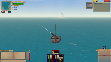
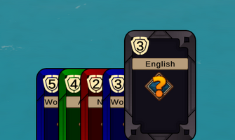
- Question Hand 🃏 - You now have a hand of question cards from which you can pick and decide what to answer on. Each card is card 'back' first, showing details about its questions not revealing it until selected (🖱️Left Mouse click).
- The number #️⃣ in the top left corner represents the difficulty of the question, from 1 (very easy) to 5 (very hard).
- The center bar 📝represents the topic of the question found within.
- The colour 🦚 of the card is also bound to the topic, helping you identify them at a quick glance.
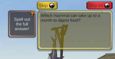
- Skip All 🏳️ - Lets you discard your entire hand of questions, on a 10 second cooldown.
- Skip 🏳️ - The skip button now discards the selected card only.
- Question Hand 🃏 - You now have a hand of question cards from which you can pick and decide what to answer on. Each card is card 'back' first, showing details about its questions not revealing it until selected (🖱️Left Mouse click).
- Menus 📖
- Certain UI elements have been repositioned, to make space for the card hand 🃏.
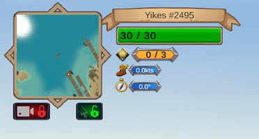
- The center movement indicators moved underneath the health bar and action charges💡.
- Camera🎥 and Mouse🖱️ Lock/Unlock indicators moved under the mini map. 🗺️
- Cannon charge 💣 bar moved next to the combat log.
- Certain UI elements have been repositioned, to make space for the card hand 🃏.
More fine-tuning to this system is to come - cooldowns, rewards for difficult questions, better animations and effects, and more.
Let me know if you have any great suggestions or complaints over at the discord channel and, as always, stay tuned for more.
Files
Explosica.zip 121 MB
Jan 16, 2022
Get Encyclopedia Explosica
Download NowName your own price
Encyclopedia Explosica
Blow-up inferior players through the power of your knowledge (before they blow you up first).
| Status | Prototype |
| Author | Slav Magic |
| Genre | Educational, Action, Adventure |
| Tags | 3D, Multiplayer, Real-Time |
| Languages | English |
More posts
- 1 vs. 1 Duels ⚔️!Jun 03, 2023
- Improved Sailing!Dec 04, 2021
- An in-game tutorial!Oct 15, 2021
- A new ship!Sep 29, 2021
- A visual bumpSep 19, 2021
- And it's out the door!Sep 10, 2021
- How to play?Sep 10, 2021

Leave a comment
Log in with itch.io to leave a comment.